
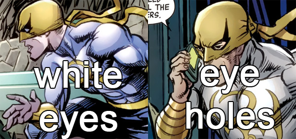
I am a huge fan of Iron Fist's mask. Sure, those masks with white eye covers aren't really all that realistic or practical, but they sure look cool. Pretty sure any reader notice if the artist draws eyes where there should be only white. Again, the change happens in just the very next page.
Luke Cage doesn't really have a costume, but he's drawn a certain way - facial hair, bald head, sometimes in a black shirt, sometimes with an over shirt, sometimes with bracers and sometimes even in a yellow shirt as a throwback to his afro-headed earlier design. How difficult would it be to arrange a phone call or email exchange to decide which version of Luke Cage's clothes were going to be in an issue?
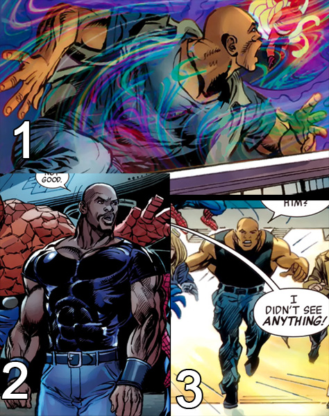
1. No facial hair, gray shirt, and a vest-like button up shirt, regular jeans
2. Black shirt, bracers, facial hair, belt, regular jeans - a very good Luke Cage look
3. Wife beater, no bracers, no facial hair, and cargo pants. Seriously, is that a whole new guy?
For the inconsistencies alone, this issue gets 1.5 out of 5.
X-Men #19
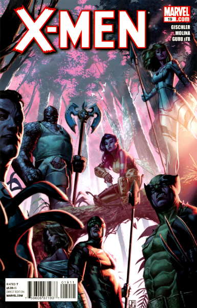
Written by Victor Gischler
Penciled by Jorge Molina
Inked by Norman Lee, Terry Pallot and Jorge Molina
Colored by Guru eFX
On the completely opposite side of the art spectrum would be Jorge Molina's gorgeous work, which reminded me a bit of Coipel's. The art alone makes X-Men #19 worth it, but what makes this issue stand out is the story and the perfect characterization of each individual involved. Cyclops was Cyclops, Wolverine was Wolverine, Magneto was Magneto and Doom was Doom. I think Doom is particularly difficult to nail, but Gischler got it.
The story flowed remarkably well given that there were two teams, and the members aren't the usual ones. Action sequences were drawn perfectly and flowed amazingly well on the page. The plot was gripping and exciting, even though you knew all of the X-Men and the Fantastic Four were going to get out alive. I think it's because of the interaction between Richards and Nemesis, which I enjoyed immensely, and Magneto and Doom, two of the most bad ass characters in all of comicbookdom. Seeing those two (former?) villains interact always sends chills down my spine.
While I love the idea of Magneto going good and Doom seemingly on his way, I have no doubt in my mind that Doom will show his true colors eventually. I'm not sure how soon it will be but it will be sooner than Magneto, if ever he does revert back to his brotherhood ways.
X-Men #19 is highly recommended, as well as the arch that led up to it. 5 out of 5.
Detective Comics #2
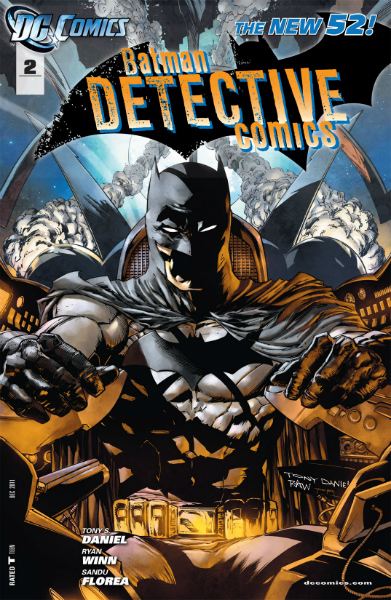
Written and penciled by Tony Salvador Daniel
Inked by Ryan Winn and Sandu Florea
Colored by Tomeu Morey
Detective Comics #2 is leaps and bounds better than the first issue! The art is more consistent and quite gorgeous, the dialogue isn't over the top (well, most of it isn't), and the story flows quite well.
The first few pages are remarkably homoerotic, with some dude taking off his shirt to go mountain climbing with Bruce. The following pages pander to male teenagers with raging hormones. I think DC's direction for Batman post reboot would be to have him have sex with everybody. That's probably my biggest complaint with regards to the reboot. Everything's too sex-fueled. Catwoman sexes everyone, Batman teases homo eroticism, and Starfire sexes everyone. I'm about to open up Huntress #1. If Huntress sexes everyone, too, I'm done with the DC reboot.
If you can get over the sexing, which lasted a few pages, Detective Comics does a pretty good job. 4 out of 5.
